
WORKUP • 2024
OVERVIEW
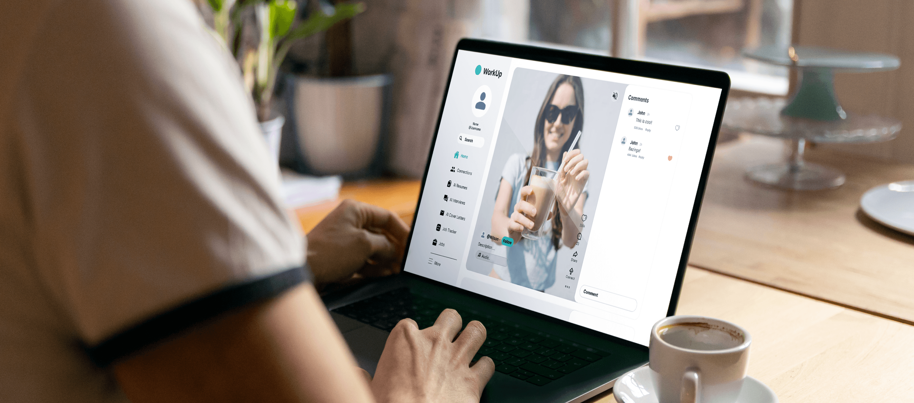
WorkUp is an AI-powered professional networking website designed to enhance job discovery allowing users network through social media. It offers a personalized feed on career centered content that helps navigate users on their professional journey. The website includes key features such as job trackers, AI practice interviews, AI cover letter, and AI resumes that create seamless career development for users.
PROBLEM
Interviews are stressful
How might we make AI-powered interview practice feel less overwhelming and more approachable?
SOLUTION
Less Friction. More Practice.
Reimagined the interview workflow to minimize cognitive load and improve usability
INTRO
Design Process
1
Research
UX Audit
User Surveys
2
Synthesis
User Persona
3
Design
Low Fidelity Design
Low Fidelity
4
Iteration
Design System
Low Fidelity Iteration
5
Reflection
Value and Impact
Key Takeaways
RESEARCH
UX Audit
Our team began by preforming a comprehensive UX audit by identifying main areas of potential frustrations and difficulties when interacting with the product. The insights not just gave us an opportunity to improvise the experience but also helped us revamp the entire application for better clarity to serve the users better.

RESEARCH
Competitors Analysis
We continued on with a competitive analysis to compare existing platforms that also offered social etworking and career development features.

RESEARCH
Users Surveys
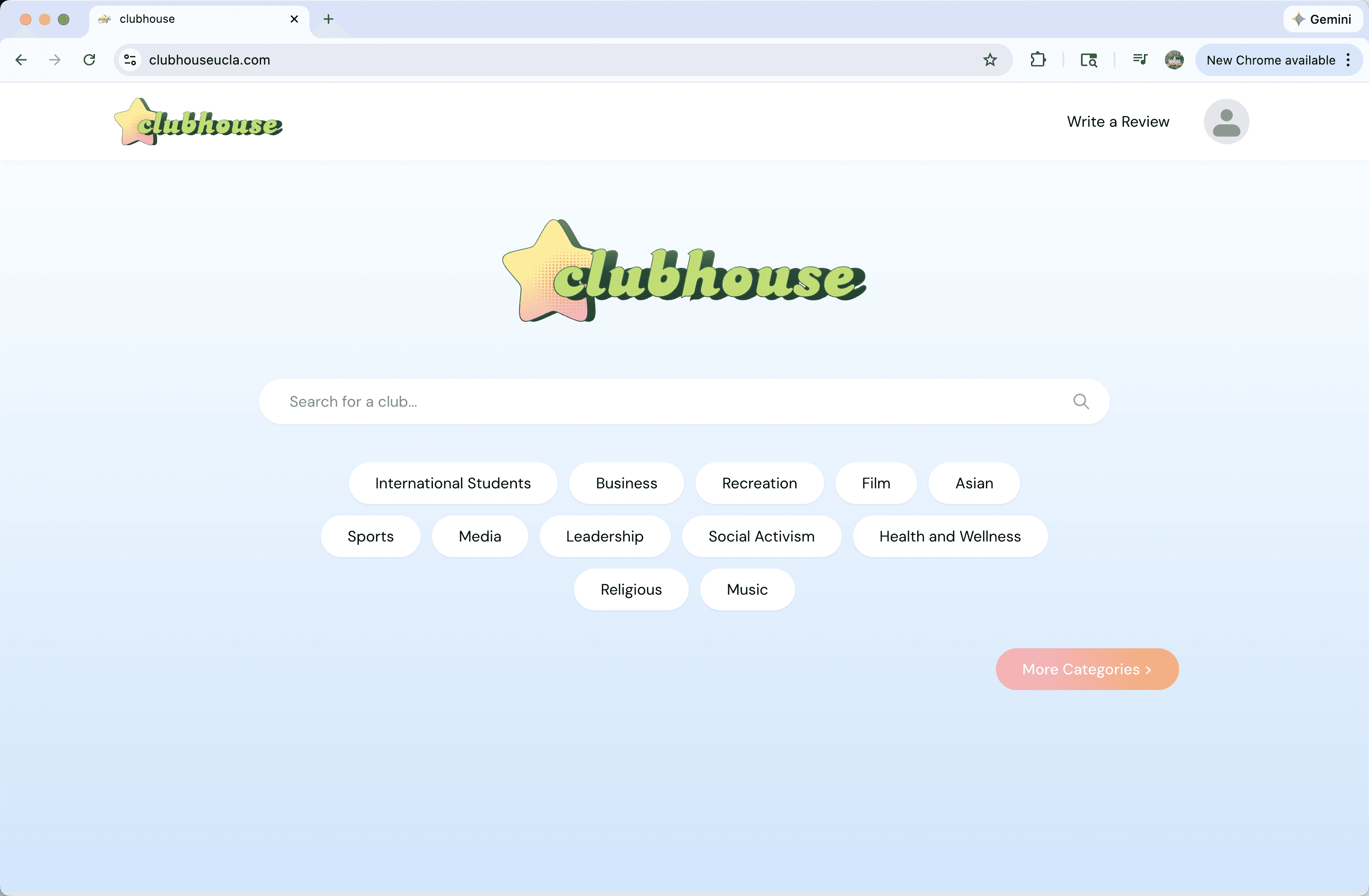
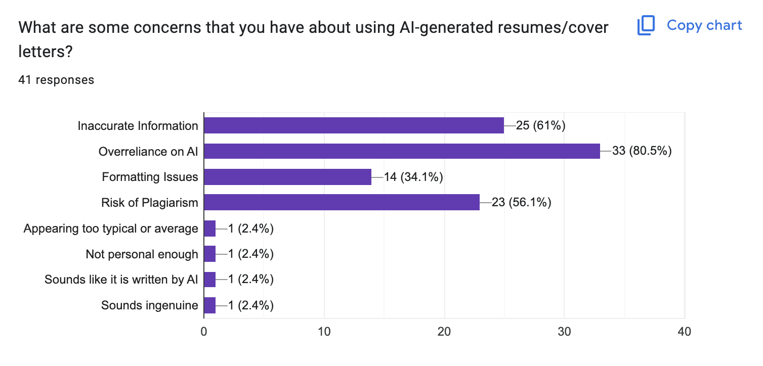
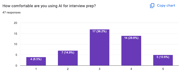
To understand user preferences, behaviors, and needs of students navigating the professional space. We conducted user surveys to understand how different user segments behave can help tailor offerings and improve overall user experience.


RESEARCH
Identifying User Pain Points
Our research gave us a preliminary understanding of how college students interacted with AI tools in the job search process.
92%
Use AI assistance to refine and build resumes
71.7%
Customize resume for every job
70%
Forget to update their tracker
RESEARCH
Key Findings
Identify pain points in the user journey and gather actionable insights to improve usability and satisfaction.
1)
Confidence & Anxiety are Major Barriers
Users struggle with confidence and anxiety when creating resumes, cover letters, and preparing for interviews, often feeling that AI tools don’t fully address these emotional challenges.
2)
Customization & Tracking
Job application tracking feels tedious and easy to forget, making users want a smoother and more intuitive way to stay organized.
3)
AI Interview Prep Needs Improvement
AI interview preparation lacks accuracy and realism, leaving users unsure about relying on it as a helpful practice tool.
SYNTHESIS
User Persona
Using our research, I developed detailed user personas to humanize the data and guide empathy-driven design.

Eliza Cruz, 18
“ First year student at UCLA”
Eliza has always been an active participant in extracurricular activities, especially in high school, where she was involved in coding clubs and STEM-related groups. He values community, collaboration, and learning outside the classroom. As a first-year student at UCLA, Eliza is eager to join clubs that align with his passion for technology and computer science but hasn’t yet found an easy way to navigate the wide variety of clubs available.
Frustrations
1) Overwhelmed with the various amount of clubs offered at UCLA.
2) Uncertain where or how to find the best STEM related clubs.
Emotional State
Confused
Overwhelmed
Excited
DESIGN
Low Fidelity Design
Simple design to represent the home page representing a basic flow of the structure of the home page.

ITERATION
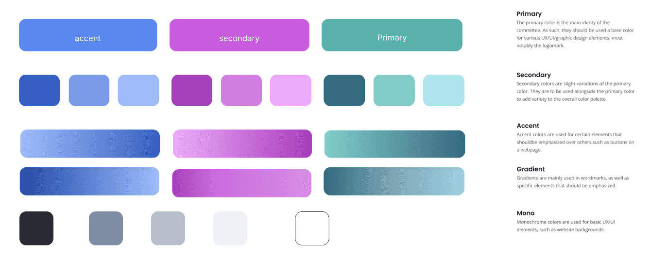
Design System
Foundational element of a design system for a better user centered design for work up.
INTERATION
Iterating over Low Fidelity
Simple design to represent the home page representing a basic flow of the structure of the home page.

FINAL DESIGN
Final Design
Simple design to represent the home page representing a basic flow of the structure of the home page.

REFLECTION
How I Created Value and Impact
90%
Increased ongoing learning
by aligning club discovery to mainstream users goals and interest.
50%
Engagement with AI features
Simplifying the user journey prevented users from becoming frustrated with the site.
REFLECTION
Key Takeaways
While design systems make things more consistent, I realize that they also need to leave room for creativity. It's important to follow the system, but still find ways to innovate and keep things fresh without losing the product's identity.
I realize how powerful simplicity can be in design. By focusing on just the essentials and removing unnecessary elements, we create more effective and intuitive user experiences. It’s amazing how a clean, minimal approach can make a product feel more organized, easier to use, and visually appealing, without overwhelming the user.
I’ve learned that not all critiques are created equal. Thought out feedback is much more valuable than vague or overly harsh comments. Embracing critiques with an open mind, without taking them personally, is key to turning them into opportunities for progress.
Check Out My Next Project


LETS MAKE A CONNECTION 🥳
RESUME